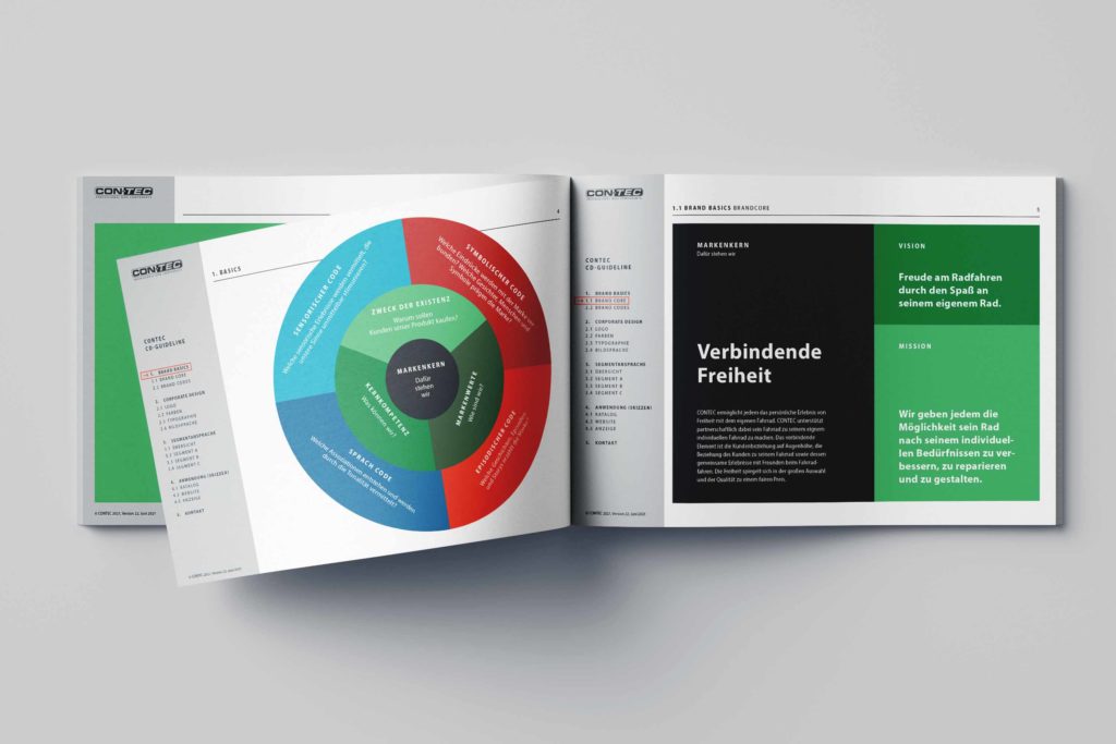
CONTEC brand positioning & corporate design
One of Germany’s best-known brands for bicycle accessories has overhauled its entire brand positioning and communication strategy in cooperation with our company. Essential CI elements have been redesigned according to the new positioning. The focus was on target group-oriented customer approach and segmentation. Our work forms the basis for a redesign of all touchpoints of the CONTEC brand.
Project information
Hermann Hartje KG
Brand positioning, customer segmentation & addressing, CI/CD redesign
2021
Target group segmentation
The first step in our brand work was a data-based survey of the status quo of the main customer groups. We have been able to develop a strategic repositioning of the brand in the course of various joint workshops. The common goal was to sharpen the brand profile and to address the different customer clusters accordingly. Three essential segments have been defined on the basis of the Limbic® Map and other tools, and a communication strategy has been developed for each of them.
Limbic® Map

Corporate Design
In close cooperation with the customer, we have succeeded in implementing a redesign of the essential corporate design elements on the basis of our brand work. The result is a significantly expanded color palette as well as an all-round renewed visual language that does justice to a differentiated customer approach and at the same time corresponds to the renewed brand positioning.
Corporate Colors
Anthrazit
#1E2027
Weiß
#FFFFFF
Grün
#78B77E
Grau
Pantone 877 C
Grün Abstufung
#3A8146
Grün Abstufung
#3B4f3B
Blau
#6BA4C1
Blau Abstufung
#3F608F
Rot
#C54434
Rot Abstufung
#992B32
Corporate Icons
Branding Design Guideline
Website
The CONTEC website has also been redesigned in line with the new brand identity. Essential design guidelines have been applied to the mobile-first concept of the new website.


